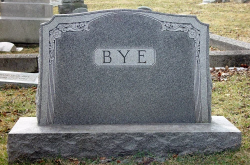
A few minutes browsing through my slush pile will yield a plethora of stories that open with some unnamed man, woman, or child. And each time I see one I roll my eyes and ask 'Why?'
The trend seems to be growing. Do authors think it's trendy? Do they think it adds an air of mystery or suspense? Do they think it helps their reader place himself into the shoes of the unnamed character?
If they think any of these things, they're thinking wrong.
If they're not thinking these things I'd like to know exactly what they ARE thinking, because not naming a main character in a story makes very little sense to me. And if you're just doing it for the hell of it--if you don't know WHY you're doing it--you shouldn't be doing it at all.
I suppose there could be instances in which it might be effective. No. Wait. I don't want to give any author an excuse for doing it. Just don't. I promise I'll be more likely to give your story more than a cursory glance if you name your character, and I'll explain why in a minute. But as I'm looking through slush I DO have an instant and automatic visceral reaction that negatively impacts my reading of your nameless character story from the very first paragraph. And that's because SO many authors have done it--and done it BADLY. I don't want to see it anymore, even if it IS done effectively.
Chances are, it won't be. Trust me. Best to not.
But why is naming a character so important?
Analogy:
You've moved to a new town and are looking for some social interaction. You hear about a dance at a local pub and decide to go.
When you arrive you're a little hesitant. What if there isn't anyone interesting there? What if you read the advertisement wrong and it's actually a party for retired dental assistants?
But you screw up your courage, check the ad again to be sure, put on your best dress, and go.
You walk in the door, find the bar, order a drink. For the first little while, nothing happens. No one seems to notice you, or everyone is already paired or trio-ed up with people they seem to be familiar with. You take your drink, knees knocking a little, and approach a small group of people who seem to be having a good time, who seem to be the kind of people you might be interested in getting to know.
You walk up to them, catch the eye of one of them, smile and say, "Hi. I just moved into town."
Wait. Something's missing there. It should be: "Hi. My name is ____name____. I just moved into town."
Whoa. Wait a minute. You give your name when you introduce yourself? Wait. What?
Food for thought.
A name is a reference. It says something about you, about your character. It gives your reader an instant sense of familiarity, which makes your reader feel instantly comfortable with your character. And if a reader feels comfortable with your character you plant the extremely VITAL seeds of helping your reader give a damn about your character.
That seed is crucial. Without it your reader is always held at arms distance from your character. Without it you may never be able to establish a meaningful connection between your reader and your character, and therefore between your reader and your story. And without that you may not be able to keep your reader's attention.
I don't care if your beta-readers said they loved your story. I don't care if your critique group didn't complain about your nameless character. In the end, your goal isn't to impress them. It's to impress me. If you don't hold MY attention, you don't sell your story. It's that simple.
Why do we read fiction? What KEEPS us reading fiction? It's characters. It's characters we care about or can relate to.
ESPECIALLY in flash fiction, you have SO LITTLE time to establish an emotional connection between your character and your reader that you want to employ every possible device to do so quickly. A name is the most obvious and most effective way.
The NAME doesn't have to be obvious. In fact, I wish more authors spent more than half a second coming up with names for their characters. An interesting name adds interest that further draws your reader in.
Think about it. When was the last time you met someone with an unusual name. Did you say, "That's a pretty name!"? Did the name pique your interest in the person? Now a name that is TOO unusual can be annoying. You don't want a name of the sort that those of us with an ounce of sanity shake our heads and think, 'He must have hated his parents all through his school years.' Not THAT unusual.
Unless, of course, the unusual nature of the name becomes part of the story! (Just because I said that doesn't mean you should run with the idea. I'd hate to see 40 'unusual name' stories in my slush pile next week.)
But I digress. The point is, give your character a fetching name.
Wednesday, September 14, 2016
Monday, July 11, 2016
ASK THE EDITOR: Question About the Definition of Flash Fiction
RaenaEnchant asked: Can flash fiction be individual stories in a series, using the same characters and setting?
ANSWER: Sure! Maybe. Depends.
Flash fiction is a complete story in a few words. For my definition, go here: What Is Flash Fiction?
Specific to Flash Fiction Online, flash fiction is a complete story--characters, setting, conflict, resolution--of between 500 and 1000 words.
To put this question in context, Raena is working on a project--a series of short segments that she can eventually compile into a larger piece.
THE most successful example of this sort of thing is, in my opinon, Ray Bradbury's Dandelion Wine. One of my personal favorite books of all time, Dandelion Wine is, as most of Bradbury's work, a compilation of short stories. But Dandelion Wine is unique in that Bradbury compiled a series of stand-alone stories, adding interludes and additional segments to give it a story-like flow from beginning to end.
To be fair, however, Dandelion Wine is a novel without a strong central plot, conflict, or resolution--though each individual story has plenty of such.
So the answer to the question is, "SURE! IF each 'segment' can stand on its own."
A Scene is not the same thing as a Story. A Scene has a function within a Story. It is used to develop conflict in order to move the plot along or to develop scenery or characterization. A Story contains Scenes that can be placed on the plotline of the story like popcorn kernels on a string at Christmastime. Scenes are not usually independent of the overarching plotline. The information within them often depends on knowing information from other Scenes. And the STORY depends on all those pieces of information fitting together to form a complete and satisfying picture when the Story is complete.
If too much of each 'segment' relies on information present in other 'segments' of the larger story, it's not flash, it's a scene. If your 'segment' relies too much on knowledge of BIG ideas--like governments, unique worlds, unique religions, civilizations, or technical ideas--it probably won't work as flash.
If too much of your 'segment' is spent explaining the missing information, it may BE flash, but it probably won't work WELL as flash.
A good flash story will be visually broken--very few large blocky paragraphs of information, plenty of dialogue and thoughtfully-paragraphed action. I can often tell just by looking at the lines of narrative on the page how much I'm going to like it. I groan (and NOT inwardly) when I open a story and it is a single paragraph. Flash is dynamic, not static, and the way the words look on the page should reflect that. The way each paragraph is constructed, the way information is revealed, the way characters are introduced, the way the reader is drawn into the story from the very first sentence, should reflect that.
If it's not flash, then, what is it? Scenes. Just scenes. Put them all together and write a novel, keeping in mind that the disciplined study of flash can help make you a better novelist!
Oh, and read Dandelion Wine. Figure out how Bradbury did it. Try to identify the scenes that were added later to form the glue between the independent stories. Very much worth your time.
Thursday, June 2, 2016
SUBMISSION FORMAT FOR THE COMPUTER AGE
Standard submission format is standard submission format for very specific reasons.
Largely outdated reasons.
Standard submission format has been virtually unchanged since the invention of the typewriter.
Today, however, much of what we read is published not on paper but on screen. Shouldn't Standard Manuscript Format evolve to meet the specific needs of online publishing?
I think it should.
Let's take a look at some of the specifics of standard manuscript format, why they might have once been useful, and why they might still be useful, or not so useful anymore:
1. 1" Margins and Double Spacing: Editors of old liked space on a page. They also preferred as small a bundle of pages as possible. The compromise was the 1" margin. A Margin large enough to write editing notes in, but small enough that a 300 page manuscript is only 300 pages, not 325. Same goes for double spacing. It provided a bit of space for writing in-line edits.
What other purpose does it have?
Some editors will tell you that double spaced manuscripts are easier on the eyes.
Hogwash. 90% of what we read--both in print and on the web--is single spaced. In the hard copy print industry, this is so the publisher can cram as much print on a page as possible, saving himself millions in paper and printing costs. We're accustomed to reading print in cramped quarters.
In the electronic publishing industry it's so we get as much information in one screen-shot as possible. The more information I can see on the opening screen, without having to scroll too much, the happier I am as a reader. Don't you hate those pages in which the picture takes up so much of the screen that you have to scroll down to read the description?
Today, all Flash Fiction Online submissions are electronic. Most markets utilize at least email submission. Very few still linger in the archaic days of hard-copy snail-mail submission. In the electronic age we have the ability to keep manuscript notes in handy little electronic dialogue boxes or use the footnotes feature on our word processors. There is no need for space.
I will, however, concede one caveat. It's simply annoying to read stories with insanely wide margins. Don't use 2 or 3" margins. It's ridiculous. It looks ridiculous. It's more difficult to read. It makes me a slave to my mouse's scrolling wheel, because a story that could be one page long is now three. Honestly.
2. Left-hand Aligned: Actually, leave that one alone. Don't mess with it. Again, it's what we're accustomed to reading. Books and magazines are left-aligned. It looks good. It looks right.
3. 12 Point Courier, Black Type: I can go along with 12 point type. Don't make your typeface too small. I'm not getting any younger. Right now my glasses are perched low on my nose to compensate for the creeping far-sightedness that comes with age. Near-sighted and far-sighted at the same time. I refuse, however, to consider myself old enough for bifocals, so you're just going to have to make sure your typeface is big enough to be easily read (12 point), but not so large that I have to, again, be a slave to my mouse wheel because the type-face is so large you only get 20 words on a page. Honestly. Just don't do it.
I definitely take exception to the use of Courier, however. I've blogged about it before. It's insane. Why Courier is still the industry standard is so far beyond me I can't even express my disdain.
Here's some courier for you. Ugh! It looks like I'm typing with an old Underwood.
Again, it's not what we're accustomed to reading--and we haven't been for a long time. I dare you. Grab any book or magazine off your shelf. Open it up. Is it printed in Courier? No. Why does anyone think I would want to read a thousand manuscripts in a typeface I don't read in any other venue?
As for black type: If you submit in ANY typeface color except black, you richly deserve the rejection you will undoubtedly receive. In fact, you deserve an EXTRA rejection, just to prove the point. Submit in black, because your story will be printed in black. It's what we're accustomed to. My eyes don't like to read purple or orange or green. Black only. Still a good and wise industry standard.
4. Indents and paragraph spacing: Guidelines on these types of spacing depend very much on the final product. If your story will be submitted to a print publication, then Standard Manuscript Format still very much applies. Print publications consistently use first line indents and no spaces between paragraphs.
However, online publication is a different matter entirely. Go, right now, and surf the web for a few minutes. Switch from site to site and observe how paragraphs are formatted. Very few use first line indents. Very few have no spaces between paragraphs. Exactly the opposite. NO first line indents. SPACE between paragraphs. This type of formatting works better in online publication. It's easier. We don't have to worry about the word processor formatting translating poorly into HTML.
Here's an example from a web page that tells you that you should always use first line indents and no spaces between paragraphs: How to Format a Short Story
Here's another example from a short story site: An Occurrence at Owl Creek Bridge
And here: And Then, One Day, the Air Was Full of Voices
I MUCH prefer submission with a HARD RETURN (Please NO formatted double spaces between paragraphs--they disappear in html.) between paragraphs and NO first line indents. This means NO use of the Tab key and NO first line indent formatting.
However, this brings up another problem. Authors absolutely MUST indicate scene breaks with some kind of symbol. A # or an * are ideal. Very simple. Small. But absolutely necessary. This should be done this way:
...manuscript
HARD RETURN
#
HARD RETURN
Manuscript...
5. Header Format: In the paper age we were told to dutifully put our last name, our title (or part of our title), and the page number in the top, right-hand corner of our manuscript. This was because if, by some unhappy chance, an editorial intern happened to be walking down the hall with your manuscript and just happened to trip and fall, and if, by chance, your manuscript happened to be in his arms with a half dozen other manuscripts and he just happened to drop those manuscripts and scatter pages all over the floor, he would then be able to pick those manuscripts up and sort all those hundreds of pages in the right order and by the right author and story.
But I don't print your story. I almost always read your story on my computer. I can actually download your story to my Kindle, or read your story on my phone while I'm riding in the car to visit my sister. There is almost no chance that the story will be messed up and put out of order by anyone but you when you submit it to me. And if, by chance, something odd happens, I can always send you a quick email, asking you to resubmit. It takes minutes of our mutual time.
There is no need for headers. No need for page numbers. My word processor or my submission software tells me what page I'm on and how many pages I have left to read.
In addition, some markets--including mine--ask you to remove all author identifying information from your story manuscript, so stories can be read 'blind.' I like that process. It allows for completely unbiased judgment of your story based solely on the story. It eliminates the creepy and elitist practice of favoritism, and gives new, untried authors equal footing with the pros.
6. The End: Yeah. Keep that. Why? We found out recently that our submission software sometimes clips off the last line or so of stories submitted in certain word processing software formats. So, for example, documents that were written with Open Office or Libre Office would lose that last, final, climactic sentence.
By simply typing a HARD RETURN, then THE END at the end of your manuscript, you reassure yourself that you won't get clipped, and you reassure ME that you did successfully download your story correctly.
Of course, sometimes that can backfire.
If I get to the last line and it's followed by THE END, but I'm not ready for the story to end...
Just make sure you write a good, solid ending.
7. Italics: When you italicize words, the italics will NOT translate to HTML. In the old-school formatting guidelines, we're asked to underline words that should be italicized when using Courier. Actually, it's probably best option for HTML usage. However, neither underlining or italics are likely to translate over well. Underlining, however, is a bit easier to see and pick out of a manuscript for later italicization when publishing.
So what do you do when something should be underlined?
None of the irregular manuscript formatting options--italics, underline, bold, etc.--are likely to translate over to HTML.
And, as far as I know there are currently no good solutions. Just do the best you can.
8. Author Information: Standard Manuscript Format says to left align these at the top of the first page. That's actually still a good idea, but not really needed. Again, it's a guideline needed for the paper manuscript. The editor has your contact information in TWO places--your cover letter and your manuscript. This lessens the odds of that information becoming lost.
But with electronic submission, the cover letter (your direct email) and your manuscript (the attachment) are inextricably linked together. The greater danger is having your submission (cover letter and manuscript both) being accidentally deleted. But that's almost always recoverable.
It's not needed, but it's not an inconvenience for our purposes as online publishers.
9. Word Count: This is also still a good idea. That word count might tell a publisher, editor, or editorial assistant how to sort your story. Maybe they have different departments for different length stories.
For some markets, such as ours, that word count is crucial. I actually LOVE it when submitters type the EXACT word count somewhere at the top of the first page. (For most markets, a word count rounded to the nearest hundred for longer stories, or the nearest fifty for shorter stories is adequate.) I don't care if it's top left, top right, or under the title. Having it there makes my job easier.
I have done it. I have committed publishing blasphemy.
Burn me at the stake.
Friday, March 11, 2016
Writing in a Foreign Language
Flash Fiction Online is an international publication.
We publish stories from all over the world, by authors of many different nationalities and cultures.
However, we're also an English language publication, which means we publish stories in English.
This creates something of a quandary. We receive a relatively large number of submissions from non-native English speakers, but publish relatively few of them.
Why?
The answer is the language. A language barrier, really. Nearly all of our non-native English speakers submit stories rife with grammar and syntax errors. As an English publication we can't print stories written in a form of English that is largely incomprehensible to readers of the English language. In addition, I do not have the time or resources to be able to work with authors whose English skills need polishing. Besides, that's not my job. That is the job of the author, to present as clean and readable a manuscript as possible for me to consider.
Let's turn the tables.
Here in the United States our high school students are required to have a certain amount of foreign language training in order to graduate. Most Universities also have foreign language requirements for graduation. While valuable, a few meager semesters of beginning German does not qualify an English-speaking American to write and publish stories or articles written in the German language.
But, just for argument's sake, let's say I wanted to. Let's say I wanted to use my limited understanding of German to write a story in German. How would I overcome the obvious deficiencies in my translation?
Google Translate? No. Absolutely not. (If you are not a native English speaker, test it by copying and pasting this article into Google Translate and translate it into your native language. See? Don't use Google Translate. It's a useful tool for certain limited applications, but is not a solution to this problem.)
There is only ONE solution: I would find friends who are native German speakers. Not only that, but these friends should be competent in the rules of grammar associated with the German language. I would ask those friends to read over my manuscripts for the specific purpose of helping me with my grammar and syntax, to help me make my story understandable and competent to native German speakers.
How would I find friends who are native German speakers?
I would spend time at multiple online writing forums and workshops, asking around until I found someone willing and able to help.
Then I would be very, very nice to that person for doing me such an enormous favor.
Monday, March 7, 2016
Courier Must Die
Today I committed editorial high treason.
I editing my submission guidelines to read, "I MUCH prefer Times New Roman or a similar font. Please do not use a Courier font. I hate them."
I hear the collective gasp of writers and editors everywhere who have learned that Courier, in its many renditions, is the industry standard.
Tough. That industry standard needs to go the way of the Dodo Bird.
Why? Because who actually reads ANYTHING in Courier anymore? No one except editors entrenched in the tradition of receiving story submissions typed on a typewriter. Because typewriters didn't come equipped with Times New Roman-like keys. They came equipped with Courier-like keys. So editors became accustomed to reading submissions typed on typewriters in Courier font types. And that became the industry standard because Courier was easier to read than handwritten submissions, which was the industry standard prior to the invention and widespread use of the typewriter.
I imagine there must have been a whole harem of editors, who were entrenched in the old industry standard of handwritten submissions, who actually resisted the change to typewritten manuscripts. Because every generation thinks they've figured it all out, that their way is the right way, that change is bad.
But the thing is, those same editors who firmly stuck to the 'handwritten is best' philosophy didn't EVER publish a book or magazine that was handwritten. Okay, maybe in medieval times. But thanks to Gutenberg and his movable type, books haven't been published in pen and ink for centuries!
Which means that people have been accustomed to reading the printed page for centuries.
I, of course, love books. I like to have them around. I like to collect them.
Over the years I've collected a number of old books, some of them more than a hundred years old. A couple probably old enough that the people who wrote the original manuscripts probably did it with pen and ink and submitted those manuscripts in pen and ink.
Astoundingly, the books I have on my shelf are NOT published in pen and ink. They're published in a lovely, easy-to-read typeface. And here's the kicker. NONE of them are printed in Courier. Not a one.
So, for at least 100 years we, as a reading public, have not been reading printed material in a Courier-like font. No. Actually, the fonts we've been reading on the printed page for the past 100+ years have been much more like Times New Roman.
Interesting.
But we kept typing our manuscripts in Courier, because that's what typewriters used. Typing them in Courier, printing and reading them in Times-like fonts. For a very long time.
Behold, the invention of the electronic word processor!
The first word processors came into use in the 60s. When I was a kid in the 70s we had a cutting-edge IBM word processor that looked very much like a typewriter. And it printed everything in a font that looked more like Courier than Times. Dot matrix. Remember that? So we were using a slightly more versatile typewriter.
Finally in the 80s word processing software advanced to the point that we could actually type on a screen that was NOT green dot matrix, and utilized changeable fonts that we could actually see as we typed. Hooray! [Side note: Unfortunately for me as an editor, this means that there are literally thousands of fonts available in the marketplace now. Unfortunate, because at one point or another I'm likely to see every single one of them in a submission. *shakes head in frustration* For an editor, that is NOT progress and a topic for another whole blog post.]
But that was thirty years ago. Thirty years. And we've advanced SO far, SO fast technologically, but have been mired in tradition anyway.
Today I can choose to type on my word processor in any font I like. What fonts do I choose? Depends on the project, for course. But for writing I use a font that looks very much like the fonts I read, and those fonts are very similar to Times. Why make myself adjust? There's no need. It's much easier on my eyes and my brain to have consistency in the visual rendering of the stories I read. To me, reading Courier is like reading High German manuscript--which is what Gutenberg used on his printing press, and which was commonly in use in German printed material until about 60 years ago. Here's an example:

Courier, it's time for you to die. It's been a good life, and we appreciate all you've done for us. I'll send flowers. RIP.
I editing my submission guidelines to read, "I MUCH prefer Times New Roman or a similar font. Please do not use a Courier font. I hate them."
I hear the collective gasp of writers and editors everywhere who have learned that Courier, in its many renditions, is the industry standard.
Tough. That industry standard needs to go the way of the Dodo Bird.

Why? Because who actually reads ANYTHING in Courier anymore? No one except editors entrenched in the tradition of receiving story submissions typed on a typewriter. Because typewriters didn't come equipped with Times New Roman-like keys. They came equipped with Courier-like keys. So editors became accustomed to reading submissions typed on typewriters in Courier font types. And that became the industry standard because Courier was easier to read than handwritten submissions, which was the industry standard prior to the invention and widespread use of the typewriter.
I imagine there must have been a whole harem of editors, who were entrenched in the old industry standard of handwritten submissions, who actually resisted the change to typewritten manuscripts. Because every generation thinks they've figured it all out, that their way is the right way, that change is bad.
But the thing is, those same editors who firmly stuck to the 'handwritten is best' philosophy didn't EVER publish a book or magazine that was handwritten. Okay, maybe in medieval times. But thanks to Gutenberg and his movable type, books haven't been published in pen and ink for centuries!
Which means that people have been accustomed to reading the printed page for centuries.
I, of course, love books. I like to have them around. I like to collect them.
Over the years I've collected a number of old books, some of them more than a hundred years old. A couple probably old enough that the people who wrote the original manuscripts probably did it with pen and ink and submitted those manuscripts in pen and ink.
Astoundingly, the books I have on my shelf are NOT published in pen and ink. They're published in a lovely, easy-to-read typeface. And here's the kicker. NONE of them are printed in Courier. Not a one.
So, for at least 100 years we, as a reading public, have not been reading printed material in a Courier-like font. No. Actually, the fonts we've been reading on the printed page for the past 100+ years have been much more like Times New Roman.
Interesting.
But we kept typing our manuscripts in Courier, because that's what typewriters used. Typing them in Courier, printing and reading them in Times-like fonts. For a very long time.
Behold, the invention of the electronic word processor!
The first word processors came into use in the 60s. When I was a kid in the 70s we had a cutting-edge IBM word processor that looked very much like a typewriter. And it printed everything in a font that looked more like Courier than Times. Dot matrix. Remember that? So we were using a slightly more versatile typewriter.
Finally in the 80s word processing software advanced to the point that we could actually type on a screen that was NOT green dot matrix, and utilized changeable fonts that we could actually see as we typed. Hooray! [Side note: Unfortunately for me as an editor, this means that there are literally thousands of fonts available in the marketplace now. Unfortunate, because at one point or another I'm likely to see every single one of them in a submission. *shakes head in frustration* For an editor, that is NOT progress and a topic for another whole blog post.]
But that was thirty years ago. Thirty years. And we've advanced SO far, SO fast technologically, but have been mired in tradition anyway.
Today I can choose to type on my word processor in any font I like. What fonts do I choose? Depends on the project, for course. But for writing I use a font that looks very much like the fonts I read, and those fonts are very similar to Times. Why make myself adjust? There's no need. It's much easier on my eyes and my brain to have consistency in the visual rendering of the stories I read. To me, reading Courier is like reading High German manuscript--which is what Gutenberg used on his printing press, and which was commonly in use in German printed material until about 60 years ago. Here's an example:
Courier, it's time for you to die. It's been a good life, and we appreciate all you've done for us. I'll send flowers. RIP.
Saturday, February 20, 2016
10 Observations from the Slush Pile
1. Do not, under any circumstances, submit a story in colored font. Black only. Please. My eyes can only take so much.
2. I'm finding I really detest that old editor's standard, Courier New (or Courier, or Courier whatever). I much prefer Times New Roman.
3. And while we're on the subject of fonts, do not submit a story in anything but the fonts recommended by A) EVERY standard manuscript format guideline or B) the submission guidelines of the market to which you are submitting. B, however, is most important. I mean, I suppose there may be some publisher who really loves to read stories in Harlow Solid Italic, and if there is that publisher would certainly make that known in his/her guidelines. I mean, there may be. Right? Maybe?
Or not. But if there is then you should do what she/he asks.
4. If you are NOT a native English-speaker who is writing in English, I cannot overstate the need for you to have a native English-speaker read through your manuscript to make sure it reads well in English.
5. Big blocks of text, with no paragraph breaks, are a turn-off. Honestly, I have yet to see a story that uses such a style that wouldn't be improved by adding a few hard returns.
6. Short story cover letters and novel cover letters are not the same. If you don't know the difference, Google it. In a nutshell, however, short story cover letters should NOT include a synopsis of the story. It's a short story. If I can't figure out what it's about by reading the first page or so (even the first paragraph or so) then you haven't done a very good job of writing it. All I want from your cover letter is a polite presentation of your story, a short list of some of your most recent or most notable publication credits, and a 'Thank you for your time.'
7. You do not need to add personal copyright information in your story file or cover letter. Copyright, by law, is implied. Also, a reputable publisher who has been in operation (and publishing regularly) for more than, say 6 months, is not likely to steal your story. Our reputations are important to us.
8. I'll say it again (and again and again and again), you absolutely MUST read and heed submission guidelines. You must.
9. I once frequented a writers' forum in which someone stated that if your grammar and punctuation are good you're ahead of 90% of your competitors. Not actually true. In my experience--and I've been handling slush for nearly 10 years--most writers can competently handle the mechanics of the English language. What most lack, quite honestly, is finesse.
10. The F-word is being tossed around like confetti these days. I, personally, am not impressed. It smacks of a crudeness and lack of refinement that I find unappealing at best. But it also weakens a once very strong word. The usefulness of a good old-fashioned f-bomb in raising or expressing tension or strong emotion has been taken away by its overuse as little more than a wasted, and nondescriptive, adjective.
Monday, February 15, 2016
What Is Flash Fiction?
In the fiction world we are given a fairly standard set of guidelines for exactly what constitutes a novel versus a novella, or a novelette versus a short story.
Beyond that, however, the rules grow murky.
What, exactly, is flash fiction?
That depends on who you ask.
In very general terms we can define flash fiction as any story shorter than acceptable short story length (usually 2000 words minimum). But anyone publishing flash fiction can arbitrarily pick and choose word count limits and still call it flash fiction, AND can choose their own name for it: short-short, sudden, postcard, minute, smokelong, fast, furious, skinny, and micro as just a few examples.
Historically, flash fiction has been around for thousands of years--think Aesop--but has only been known under the flash moniker since 1992 when Editor James Thomas used the term to title his short story anthology, Flash Fiction: Seventy-Two Very Short Stories. Before 1992, before flash was recognized as a separate form, greats like Chekov, O. Henry, Kafka, Ray Bradbury, H.P. Lovecraft, Mark Twain, and Kurt Vonnegut wrote flash-length stories.
For the 21st Century writer, the form is wide open, with markets everywhere now accepting very short stories and readers everywhere gobbling up a form that seems made for the frantic lifestyle we've come to lead. Stories that can be written, edited, and submitted in a matter of hours. Stories that can be read in the length of time it takes to smoke a cigarette, or drink a cup of coffee, or wait for a train. Stories short enough to be enjoyed between classes, or while waiting at the doctor's office, or in the supermarket checkout line.
But there is more to flash fiction than merely length.
For writers, the form presents a new challenge. How do I tell a complete story in so few words?
Granted, many writers use the form in writing and publishing vignette (also known as stream of consciousness or slice of life). And it lends itself beautifully to that. Those types of stories rarely work well at longer lengths anyway, and the shorter form is a wonderful way for the writer to explore the beauty of language and emotion without exhausting their appeal to an audience that might not otherwise read a high literary style. Other types of flash include Nonfiction Narratives, which, based on length, are dumped into the flash 'fiction' category despite not actually being fiction; and Prose Poetry, which tends to be a VERY literary styles in which language trumps all else.
In my opinion it's relatively easy to present a vignette in 500 or 700 words. One of the true challenges in writing flash fiction is in the careful crafting of a complete story--characters, setting, plot development, resolution and all. A writer who chooses to study the form and accept this challenge will, invariably, come out the other end of it a better writer.
It is tempting to use the idea of flash fiction and apply it to something more akin to a story synopsis. This is not flash fiction. How do you tell? If dialogue is sacrificed for explanatory narrative, if your paragraphs are long and blocky, if you find yourself 'telling' too much and 'showing' very little, if more than 10 to 20% of the story is taken up with description rather than action, if what you're presenting seems like part of a larger story, is a scene from a novel, or an episode in a serialized story.
Learning the art of complete-story flash fiction forces a writer to examine every word choice, every character description, every plot point with precision and economy. Some flash writers quip that if Robert Jordan had studied flash fiction first his Wheel of Time series might have been a few hundred pages instead of 15 doorstop-sized volumes that he never actually lived to complete. I'm sure Robert Jordan fans would argue that fifteen volumes wasn't enough. Having never read Jordan's series, I suspect the truth is somewhere in between.
In the end, writers should understand that what constitutes flash fiction is at the discretion of the publisher, and to become a successful author in the form requires two things: First, that you be familiar with the markets to which you intend to submit; Second, that you ALWAYS study submission guidelines before submitting.
For more on writing flash fiction, visit Managing Story Length and Thirteen Tips for Writing Flash Fiction.
Subscribe to:
Posts (Atom)

